Loading...
  OR  Zero-K Name:    Password:   
Back to List

Mechadansonia v1.02 Featured

By Dregs
Rating:

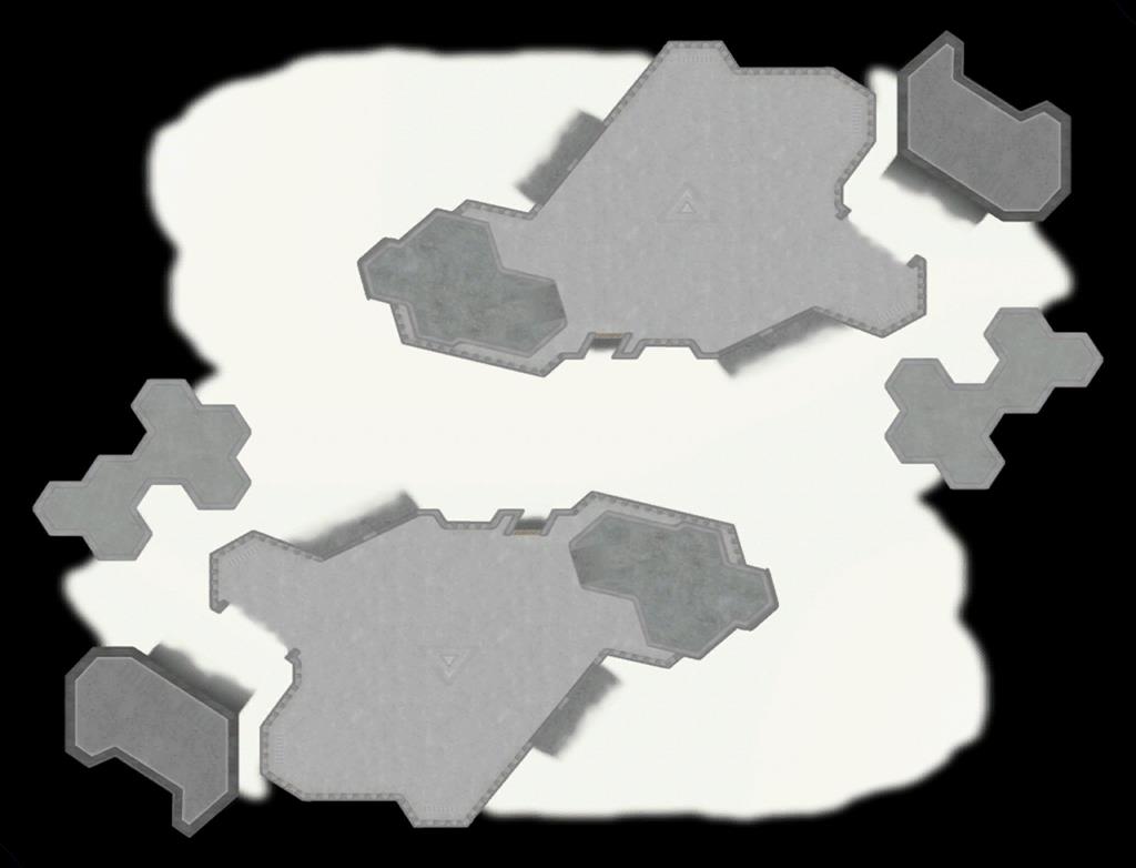
Once a vibrant island, Adansonia has now been claimed by the machines.
Size: 16 x 14

PLAY ON THIS MAP


Downloads: 9107
Manual downloads:
http://zero-k.info/content/maps/Mechadansonia_V1.02.sd7


Preview
Filter:    Player:  
sort

3 years ago
Oil water makes F2 pathing vision sad
[Spoiler]

I had no idea this was possible and doesn't seem all that intuitive in-game:
[Spoiler]

I guess it shows up on the pathing vision minimap at least
[Spoiler]
+4 / -0


3 years ago
Oil water makes almost everything invisible. Amph unites are invisible. Their projectiles are invisible. Their selection circles are invisible. It should be toned down.

Also I think the sand in the middle is too bright, especially for cloaked units.
+2 / -0


3 years ago
Agree with the above and have noted all of these issues. Anyone is more than welcome to alter the brightness/water variables and re-submit the map to Aqua for alteration to the pool. I'm still in poor health and the 2020 map update gave me map burnout on a heavy level, which is one of two reasons why I'm not rushing to update this map. The other, less relevant to the aesthetic, reason is that I think the map is fundamentally flawed from a gameplay and factory balancing point of view.
+1 / -0


3 years ago
For reference:


I have not played it that much but I feel like the layout is an improvement on Adansonia. The land paths are slightly straighter. Also I like the blocky vs. sandy style.
+2 / -0

I made a sun and water override: https://github.com/ZeroK-RTS/Zero-K/commit/60c44f90f9ac93ae413d553e8776a7563ec97b30

it is possible to see units underwater and the shallow ripples reveal the shallow parts. The river looks a bit worse, but I did what I could with the parameters.
+3 / -0


3 years ago
Really appreciate you stepping in and sorting that out. It looks better than I imagined it might.
+1 / -0
3 years ago
This map still has serious visualization problems though. The black water makes it impossible to see the borders of the map and to judge depth.
+1 / -0


3 years ago
Have those things meaningfully affected your ability to play the map?
+0 / -0
3 years ago
Yes. Not seeing the borders suck, specially because the width of the water surrounding the map has wild variances. It suddenly becomes really thin in some spots.

Not seeing depth or the water surface makes it difficult to tell when amphibious bots are exposed to surface fire or not
+0 / -0
If you load the map up, you can't see the border well at first. But the moment the game begins the border is stark enough that you can easily see and understand it.

Here's how it looks for me:


In the image above, it's also easy to tell which ducks are vulnerable.

If you can show me a replay where the conditions you're speaking about unquestionably interfered with the outcome of the game, we can review some changes. That said, I don't see how players are able to judge which depths are exposed or not on many other non-black water maps.

If this really is as "serious" as you put it, what do you want to do?
+0 / -0
3 years ago
That isn't what it looks like for me, for me most of the water was solid darkness, and there was no visible distinction between the border and not-border. I suppose it may be the fault of the graphical settings, mine tend towards the lower end.

I think it would improve visualization if the space outside the map was a different color as is the case in most other maps (not sure how mappers decide that). Bottom visualization is hard to say since it might be dependent on graphical settings. I guess it would be nice if it were more visible. Even in your screenshot which has more detail, you still can't see the bottom in some spots.

quote:
If you can show me a replay where the conditions you're speaking about unquestionably interfered with the outcome of the game, we can review some changes.


In the first and I think only game I played on this map, I wasn't sure at first if the water even *existed*, in the sense of being cross-able. I thought it might be intended to be void-space in most places, or acidic. I started the game with an amphibious factory just to investigate that. After determining that the water indeed was meant to be entered, I still didn't know how deep it was anywhere and therefore how battles would turn out in terms of depth.

Saying that it "unquestionably interfered with the outcome of the game" is a high and to be frank unnecessary bar to clear. Its hard to gauge exactly the extend to which someone's performance was affected by visualization problems. Fact is, I found the map uncomfortable to play, and don't intend to vote for it again in its current state. And I think this is the first time I decide I don't want to play a map again solely due to visualization problems.

(although to be fair a lot of other maps have problems with water that isn't obvious or whose cross-ability/depth is difficult to gauge. This one just stuck out as being rather extreme to me)
+2 / -0
Having played the map more than once, do you still have the same issues?

P.s. Thanks for explaining it logically.
+0 / -0
3 years ago
I guess I will get back to you if I still feel the same way after playing the map a few more times.
+0 / -0


3 years ago
BRrankManored the first rule of graphical feedback is to post a screenshot.
+0 / -0
3 years ago
Ok, this is what the map looks like for me (focusing on the water). I set the graphical presets to "low" before this so this is theoretically what it looks like on low graphical settings:

[Spoiler]
+0 / -0


3 years ago
Ok. That makes all the difference and I can now definitely sympathize further. That said, your case now makes it a lot more difficult for me to be able to "fix" reasonably, as it appears somewhat specific to low settings. That becomes less of a map issue and more of a rendering engine thing.

As a consolation, my advice would be to familiarize yourself with the border, especially via cross-referencing the minimap and the main screen. You will have learned by now that "around the outside" is safe depth for amphbots, and anything else (other than the center of the pool) can be considered unsafe. Have a look at Birdulon's pathing vision image.

If you still can't get on with it at your setting level, please just ban the map and I'll have to hope that my future ones are more compatible for you with the lessons learned here.
+0 / -0
3 years ago
Indeed, basically the water has no visible surface, whereas in your screenshot it has one. That makes all the difference.

To be fair, when I first commented on the map I thought it looked like that for everyone. I guess its not unreasonable for maps to not look ideal if you're playing with low graphical settings or lowest.

I think my machine can probably do better most of the time, but I like to leave it on low because I don't wanna risk unnecessary chugging and having to fiddle with graphical settings ingame when a lobsterpot game decides to get huge and last really long.
+0 / -0

2 years ago
map looks weird
+2 / -0


2 years ago
Looks like something happened to your water and it's now robot milk instead of robot cola.
+1 / -0


12 months ago
Unsupport and remove at request of map creator.
+0 / -0
Back to List