|
|
These are some outstanding casts. Shadowfury, I like the informed commentary you provide and the enthusiasm you bring to the event. I disagree with some of your choices regarding visual presentation, but that's mostly just a matter of preferences. Zero-K could use a whole lot more casts like this. (... and like those from Floris, who also does great work. And anyone else who wants to step up and give it a shot!)
+2 / -0
|
  CrazyEddie CrazyEddie: Out of curiosity, what exactly do you disagree with and why? Is it personal taste, or is it concern that the choices negatively impact Zero-k's potential reception with new players compared to the alternatives?
+0 / -0
|
Oh heavens, no, nothing so perilous. Merely personal taste. I wish you'd zoom in more on combat and zoom out more to a strategic view (with icons) rather than rely on the minimap. Using the outline shader makes the units stand out at the distances you've chosen, which is good, but it makes them look a bit cartoony. I wish you'd adjust the brightness to make the dark maps not so dark and the bright maps not so bright. I wish the teamcolors were more prominent. Etc. But all of this is merely a matter of taste, and there's nothing wrong with yours.
+1 / -0
|
CrazyEddiequote:
I wish you'd adjust the brightness to make the dark maps not so dark and the bright maps not so bright. |
The easiest way to accomplish this is via tone mapping, as I mentioned elsewhere. This graph shows that it does exactly what you want, and it also nicely allows for bloom shaders to have a single threshold value for everything that makes physical sense (i.e. everything brighter than 1.0, and with proper use of logarithms the initial brightness above 1.0 can be used to determine the bloom colour and strength). As an aside, implementing this and a bloom shader to go with it was the first thing I did when I got my current job. However, I'm not sure how possible it is to intercept Spring's standard lighting and shading (assuming it even uses shaders), so this may be an engine-side thing rather than a LuaGL thing. CrazyEddiequote:
I wish the teamcolors were more prominent. |
Is that an option? If so I'll go configure that, because I want them to be at-a-glance obvious for everything.
+0 / -0
|
quote:
I wish you'd zoom in more |
Yeah I've been yelling him that for years! Maybe if I put it another way. The casts are excellent for existing ZK fans who love to see a good game and hear some informed commentary on it. But zooming in would also showcase the game to new people so they can see the beauty of the models, effects and physics and really appreciate it enough to try the game out. Yeah we ask a lot, but you can do it!
+0 / -0
|
quote:
this may be an engine-side thing rather than a LuaGL thing |
There's a widget called Darkening or something like that; you can find it in F11 and enable it. It creates luaui commands that you can then use to manually increment, decrement, or set the brightness level. It's not the same as the tone mapping you've described, but it would let you increase the brightness when you start a game on a map that's too dark, or decrease it on a map that's too bright. BTW, your job sounds like fun. :) quote:
I want them [teamcolors] to be at-a-glance obvious for everything. |
Under Settings -> Graphics -> Unit Visibility there's a few options you can play around with. I fiddled with them a lot until I found a mix I liked, but this is definitely a personal taste thing. For me, I like using the X-Ray Shader. It's pretty neat, especially if you tweak the slider settings. It draws teamcolor on the model's vertices. The kicker, though, is that it gets bolder when you zoom out and fainter when you zoom in. That way, close in the unit's normal teamcolor panels predominate and the units look pretty; zoomed out those same panels are effectively invisible, but the x-ray effect on the vertices intensifies to compensate for it. I also like using Spotter, but there's nothing subtle about that. It may be too much teamcolor for most people's liking. There's also a bunch of widgets in F11 that do some similar things: Selection Squares, SelectionCircle, TeamPlatter, UnitGroups, XrayHaloSelections, Selection BlurryHalo, UnitShapes. I haven't tinkered with any of them lately, but if you do, you might find some combination that appeals to you.
+0 / -0
|
I have XRayShader on, set up to basically look like the units' team colours are becoming the only thing visible at a distance (I set the defaults to be more subtle than what I have now when I added the distance thing to it) I was hoping you meant something that made the teamcolour patches themselves brighter. Also, working on zooming in more. It's just sometimes hard to show context, but I'm definitely thinking about it when casting.
+0 / -0
|
quote:
Also, working on zooming in more. |
Now I waited to long to click "submit post", but still: Think it is a bit better than in previous videos but still much "dead empty space" in the video. Worst is a view is like this: 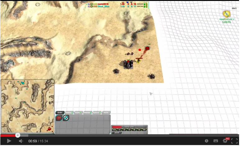 Zoom in on the base/commander to avoid having 50% of screen show off-map. When playing that is ok but in videos it just looks wrong, and it is so easy to avoid ;) (well, in theory) Nice casts and everything but think that would make the videos dozen times more attractive to watch. Even when there is no mapedge, still zoom in closer. You want to show the units not so much the land around them.
+0 / -0
|
I agree that you could try experimenting with zooming in some more, @shadowfury333. In addition to that, you could add some cool camera tilting and angles for a bit of a cinematic feel, since you use the combo overhead camera. I think your idea of listing the players' starting factories in the video name is a really nice idea, and tells a lot about the match wihout spoiling anything. However, I think listing any subsequent factories in the video name isn't relevant info about the setup anymore, and imo it reveals a bit too much of what's about to happen in the game. Heh, I was really surprised in the planetXVII game, which you'd listed as shield vs shield, when norm made both spiders and cloakies too. Btw, why is Anarchid vs TheSponge always listed as the first vid in hour ZK casts? Edit: Oh and very nice casts this time! Somehow I especially liked the Pony vs GF game, I guess I enjoy seeing the underdog win. I kept expecting some epic comeback from Google all the time, but Pony's map control was too much. Oh and the Godde vs Saktoth game 1 was lolz.
+0 / -0
|
quote:
Btw, why is Anarchid vs TheSponge always listed as the first vid in hour ZK casts? |
Alphabet, maybe.
+0 / -0
|
If you guys think rotating around will look good and not disorienting, then that's great. I mainly avoid it for the same reason I avoid zooming in too much, for fear of disorienting the viewer. If that's a misguided concern then I'm all too happy to be cinematic. I do it from time to time with Achron and that seems to go over okay. Granted I'm often showing off the Depth of Field effect more than anything (I worked hard on that effect darn it).    sprang sprangquote:
Btw, why is Anarchid vs TheSponge always listed as the first vid in hour ZK casts? |
Because the initial news post regarding my casts was pointing to it, so it was the way people were linking to the playlist as a whole from the start. I wanted to have the first video in the list be the one linked, whichever it was at the time, but YouTube doesn't seem to have a dynamic link option for "first in playlist". Given this new newspost, I can probably shift it into the date-appropriate spot. sprang: quote:
I think your idea of listing the players' starting factories in the video name is a really nice idea, and tells a lot about the match wihout spoiling anything. However, I think listing any subsequent factories in the video name isn't relevant info about the setup anymore... |
That's something of an artifact from Achron casts. With Achron, players can switch their species for the first few meta-minutes of the game, so I use that notation to show when they are switching in the order of switching. When I started ZK casts, I decided to reuse that notation for all factories built in the early game, but then I wasn't sure how early that would be, so I started including all of them. I suppose if I cut it off at 3 minutes or so with ZK it would avoid spoilers while still indicating a game where a player basically switched out of their plopped factory right away.
+0 / -0
|
I agree with others here, it would be good if you zoom in on combat more and zoom out to talk about the strategies going on, eg. zooming out to explain why player 1 is expanding like crazy down the west side of the map while player 2 is distracted by the fighting on the east side. quote:
Btw, why is Anarchid vs TheSponge always listed as the first vid in hour ZK casts? |
Because it is the best, obviously! ;)
+1 / -0
|
You used to say the same to me about my camera and mouse movement :P I once tried to only move the camera around with the arrow key's to make it all more smooth. But i felt that i couldn't show everything fast enough. Tbh, i don't mind watch all the icons. Eventually, that is how your ZK game will look like. You know what, i'm going to make a new video as well! :P ZK needs more casts :D
+2 / -0
|
Hardcore ZK players probably won't mind the icons, but this isn't just for the existing ZK players, as much as I appreciate your support. This is also for advertisement of the game to people who don't know about it, and while they probably will see icons a fair amount by default, they may not like that and it's good to know that there is an alternative. At the very least, it doesn't make things look like dotwars, though ZK's icons are definitely better than SupCom's for not looking like a NATO war room.
+1 / -0
|
I think the icons can be a selling point. As you say, they're nicer than SupCom's, so that may impress some SupCom players. And for anyone who hasn't played with strategic zoom (maybe coming from StCr or something) then it will be an eye-opener. But I agree with you, you don't want it to look like dot wars. So perhaps keep the icon distance cranked way up, and most of the time stay close enough to see units, even in long shots, but from time to time zoom way out to give an overview of the game so far and show off the icons. Just suggestions, of course.
+1 / -0
|
I added a couple of features to COFC that might help casters zoom in and out: https://code.google.com/p/zero-k/source/detail?r=11721I also added a new widget that might help casters control when icons are displayed: https://code.google.com/p/zero-k/source/detail?r=11745
+0 / -0
|
Well, since nobody announced them yet, i'll just link those casts here:
+0 / -0
|
Quick question about casts: is it possible to record a cast against a game replay? It would be awesome to be able to attach your camera to the commentators view, but then detatch when you want to check something out. Obviously it would need to sync to the game, etc. Anything like this in the engine?
+0 / -0
|
The caster could record his camera path. I don't know how the widget that does that saves it, but i'm sure it can be uploaded alongside the cast and then played back by your version of the widget. I do not know if it would be possible to "detach" from that (and especially "reattach" afterwards) though.
+0 / -0
|
