This is meant as a side thread from http://zero-k.info/Forum/Thread/5770?postID=68671 because I did not want to derail it and fill it with pictures of peoples interfaces. I think that the default element positioning could do to change. I found it difficult to do things fast when I needed to do them at every different corner of my monitor. I have now changed my design and find it much better. I think that the defaults should be changed to a design decided by the community. Everyone post a picture of your UI setup and why (if at all) you think the defaults should be changed. 
+0 / -0
|
 I think the default one is good and if u don't like it, u always can change it.
+0 / -0
|
 For those who don't know: Minimap FacPanel Selection window KeyboardMenu Chilichat Coreselector is enabled and shrunk only because it enables ctrl-c. I don't need to use it when facpanel and kbmenu are available. Minimap has an option called Aspect Ratio Map which maintains the window size and resizes the map within it. Selection window has an option to remain even when no unit is selected. Goals: Opaque. I can't read chat, resource numbers, playerlist stats that are tiny characters imprinted on terrain, units and radar icons. Some windows are still translucent, I would desire them to be more opaque but that requires code changes. Monolithic. Like TA and other games (  ), the majority of the UI is on the left. The screen is divided into two pieces instead of seven. My eyes can easily ignore the left side if I'm focusing on the map, and ignore the right side if I'm focusing on the UI. Playerlist and resbar are breaking the rule, unfortunately.
+0 / -0
|
|
|
|
|
I added my UI goals to my post. quote:
Isn't your UI positioning silly? |
If you have criticisms, you should share the specifics. I'll share mine with your screenshot: Transparent chat, resbar numbers and playerlist are hard to read. Random clock (maybe you didn't notice it?) unneeded. Selection window is higher than integral menu, makes a bump. Big gap under selection window to the right of core selector. Basically looks like a desktop with a bunch of windows placed randomly so you can see them all at once. What's that thing on the right with the air units?
+0 / -0
|
How do I make Deluxe Player List big enough to fit all players on it without scrolling? Even in 1v1 it has a scroll bar.
+0 / -0
|
 Note that i have much smaller screen than most people. Also: - all non-essential stuff is edged carefully to be collapsible - chat is edged to top so that it's top-collapsible, right-scrollable, when edged right or left, collapsibility conflits with scroll - top edge is relatively unmolested, and top center is left untouched, this area is very important with any nonzero tilt! - approx average distance from center to each control, no intersecting controls during mouse movement from center to control (only exception is EPICMenu, but that is usually hidden anyway to not eat pixels)
+0 / -0
|
quote:
Transparent chat, resbar numbers and playerlist are hard to read. |
Don't agree, the font has a dark outline to it's perfectly readable imo. The absolute values in the bars themselves aren't important, the bars show if you stall or excess e or metal. Your income/spending numbers are way more important anways, and those are very readable, in my eyes. quote:
Random clock (maybe you didn't notice it?) unneeded. |
I think the elapsed game time isn't too bad to know. And i love how ZK has the inbuilt (real life time) clock so you can keep an eye on when you might have to leave for something. I liked both in the defaults. If there's one thing that might help new users then it might be having your selection window in the bottom center of the screen. Just my 2 cents (inb4 streamlining debate).
+0 / -0
|
    CarRepairer CarRepairerOh. I have not posted an explanation yet when I posted it. quote:
If you have criticisms, you should share the specifics. |
I wanted to say that your UI is so different than other people's UI. Actually, what screen resolution do u have? quote:
What's that thing on the right with the air units? |
It is my air widget which allows me to choose one or all bombers with ammo.
+0 / -0
|
> Don't agree, the font has a dark outline to it's perfectly readable imo. Look at @spr1ng 's screenie and try to read the team aggregate metal. > I wanted to say that your UI is so different than other people's UI. Actually, what screen resolution do u have? I know, that's why I added the huge explanation about it. 1080.
+0 / -0
|
31 and 27. In the downscaled forum version it's unreadable but i wasn't troubled to read it in normal resolution. Sure, it could be easier to read with opaque background, i'm just arguing that it won't necessarily suck as default.
+0 / -0
|
   TheSponge TheSponge: How do I make Deluxe Player List big enough to fit all players on it without scrolling? Even in 1v1 it has a scroll bar.I wish I knew. That's on my buglist, and if I ever get time to work on Deluxe Player List again that's going to be one of the first things I tackle. I spent some time on it before the last release (months and months ago) but couldn't figure it out then, so I just left it. I know. It's ugly and annoying. I'm sorry. Maybe somebody smarter than me can figure it out first.
+0 / -0
|
Here's how I set up my playing interface  and my spectating interface  The player list would probably be at the bottom if I wasn't primarily using it for spectating and casting, but since I only play 1v1 it's not a bother for me. Overall, the setup was inspired by an article I read about how FPS interfaces basically work by constructing a spiral based on the golden ratio, but mirrored it along the y axis, since having everything on the right tended to draw my attention to the panels and away from the map. The benefit I find is that 3/4 to 13/16 of my vision is the map (which given how important exact positioning and rotation of units is, is handy) and everything but the minimap is transparent, so I can still see what is there, even if I can't touch it without scrolling.
+0 / -0
|
quote:
Overall, the setup was inspired by an article |
This article seems to be interesting for me. Can you post a link?
+0 / -0
|
I wish I could find it too, but alas any Google searches I do for the article turn up nothing. I know I saw something that had nice screenshots with a demonstrative spiral moving between rectangles on the screen showing the ideal placement of a gun in an FPS game, but I can't find it.
+0 / -0
|
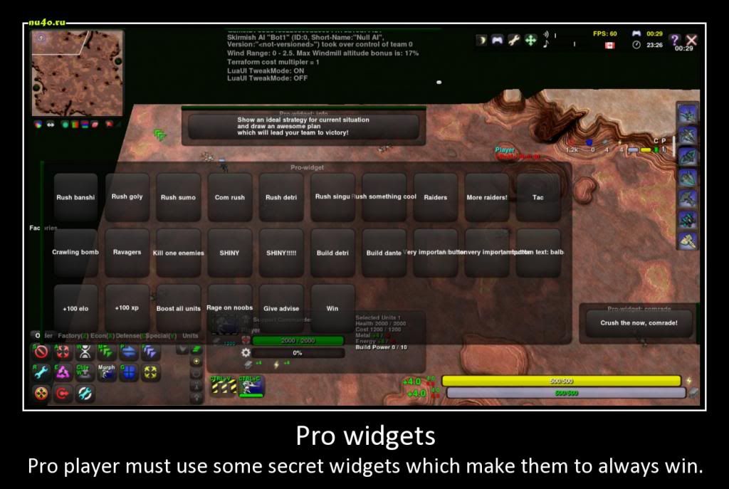 Do u use some secret widget?
+4 / -0
|
New chat. 
+1 / -0
|
I'd remove that factory panel, put resources back to the top right (or left) corner, minimized chat and minimal player list. On your monitor you could put the chat where that factory panel is now, on more narrow monitors you can let the chat disappear in it's current location.
+0 / -0
|
I don't understand why people use the factory panel. I use the factory bar because it leaves more visible space than panels.
+0 / -0
|
